The incredible boxes of Hock Wah Yeo 
When Hock Wah Yeo was hired by the game publisher Velocity, the head of the company gave him an unusual order: “Scare me.”1
Yeo wasn’t a game designer or a writer. He was designing their packaging.
▲
Let’s say you go to the store and buy a video game. What does it look like? Chances are, it comes in a plastic box, roughly the size of a DVD case, and there’s a logo on the top that tells you what platform it’s for — Xbox, PlayStation, Nintendo. It’s easy to understand, and it’s easy to fit on shelves. Retailers like it. The platform owners like it. This is the way it’s been for decades — simple, predictable, and safe.
It wasn’t always this way, especially in the computer game industry, where anyone could make a game without needing to get permission. In the early years before the industry was standardized, computer game packaging ran the gamut from loose floppy disks in Ziploc bags2 to big, intimidating boxes as thick as a dictionary. But why stop there? How about something even weirder or wilder? If there were no rules, why did you have to sell games in a rectangular box at all?
If you really wanted your game to make an impression, you called Hock Wah Yeo.
Yeo is a graphic designer based in the San Francisco Bay Area, and through the 80s and 90s, he created the boldest, most unusual packaging in the game industry. While other game publishers were trying to get attention with flashy, colorful, in-your-face aesthetics, Yeo was deconstructing the idea of what a game box could be altogether. He made boxes shaped like pyramids and trapezoids, boxes that conveyed emotions and movement with their physical shape, designed to stop people in their tracks and get them to pick it up. And whether he intended it or not, his work landed him right in the middle of a battle for the future of retail space.
In this article, we’re going deep into the game packaging design work by Hock Wah Yeo, the developers who hired him, and the industry that could barely keep up.
▲
In the span of Hock Wah Yeo’s career, making game boxes was something that happened by accident.
Yeo was the co-founder of the Design Office of Wong & Yeo, a graphic design firm he ran with his partner at the time, Valerie Wong.3 The Design Office worked on a wide range of projects, including corporate branding and even interior design, but Yeo was especially drawn to the work they did with product design and packaging.1,64 He was interested in what he described as “the art in practical things” — the design aspects of everyday objects, finding something ordinary and turning it into something unexpected.1,4
Unfortunately, his earliest clients didn’t quite allow him to be as creative as he wanted. One of his first jobs at the Design Office was designing packaging for wine bottles, but he found it to be stifling, unexciting work. The wine industry is steeped in tradition, with a long history of standards and expectations for product design that didn’t leave him much room for creativity. “I’ve done odd-shaped labels on them,” Yeo said, “but still, you have to have a standard bottle. You can’t change that shape.”1
Everything changed for Yeo one evening at a wedding dinner, when he crossed paths with Thom Hayward, a creative director at Broderbund Software. Hayward was responsible for handling Broderbund’s packaging, and as it happened, he was looking for a new designer to work on one of their upcoming products.
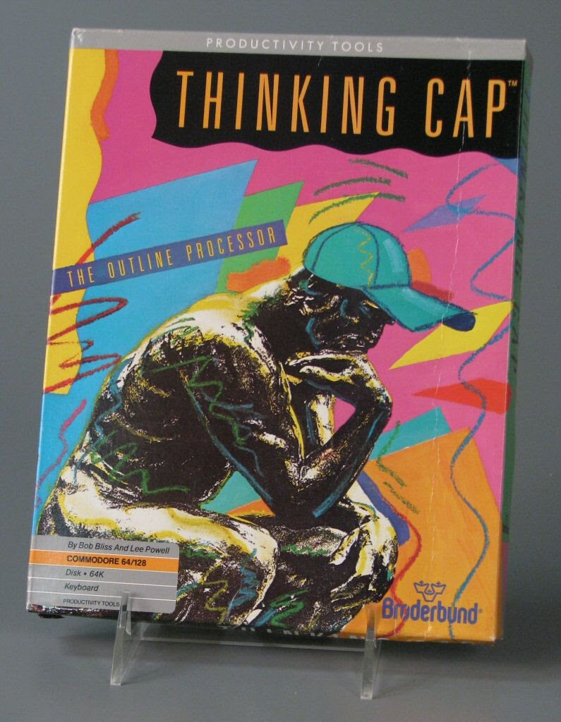
That’s how Yeo landed his first work for the software industry, creating the cover art for… an office program called Thinking Cap. It was not a high-profile piece of software. “I mean, they weren’t gonna risk a big game on me for the first time,” Yeo said, laughing.1
Thinking Cap has a busy cover, featuring crayon-style shapes and squiggles in a bold neon-pastel palette in the style of the Memphis design movement from the 80s. It was more than Yeo could’ve gotten away with on a wine bottle, for sure, and it’s certainly a surprising look for what was, effectively, a program that helped you write outlines.
From that point on, the Design Office of Wong & Yeo became a staple in Broderbund’s line-up of designers. Among other things, they designed the packaging for a majority of the games Broderbund released for the Nintendo Entertainment System, including well-known titles like Lode Runner and Deadly Towers. It might not have been the most exciting design work, but compared to other boxes for NES games, they have a unique, sharp style, with the art illustrations partially covered up by a solid-texture cutout. And most importantly, the Design Office put their name on the underside of every box. It was unusual at the time for external designers to receive credit like this, especially on Nintendo games, but they wanted to be acknowledged for their work.1

Box art courtesy of MobyGames.
While Yeo’s early design work for Broderbund is good, it’s not too much different from what else was out on the market. But soon, a project came along that would let him approach packaging design from a completely new angle.
Broderbund had signed on a new developer, Velocity, to publish their upcoming flight simulator game JetFighter: The Adventure. “They wanted to make a big splash with their product,” Yeo explained, and Broderbund assigned him to work with the studio on a new box concept. Now a trusted designer for Broderbund, Yeo was given carte blanche for the first time to come up with any idea he wanted.
For inspiration, he visited software stores to see what stood out. “We went to the stores and looked at what’s being displayed,” Yeo said, “and we noticed that, at that time, just in any retail stores, there’s a lot of noise, a lot of colors, messages yelling at you” — but it was all two-dimensional, printed on the sides of rectangular boxes.
“We just realized that the one thing they haven’t done was to differentiate their product with form.”1
▲
As the software industry was growing, packaging was a big driver for sales. More people were buying computers, but they didn’t necessarily know what software was out there. Even by the early-mid-90s, reviews, previews, and advertisements for software were still a bit of a niche market, so unless consumers were reading computer and gaming magazines, they probably didn’t know what they were going to buy until they walked into the store. That’s when an eye-popping package would get their attention.6
Software Etc., one of the major American software retailers, put a premium on good-looking packaging. “It is 80 to 90 percent of whether or not we carry the product,” said Chuck Whitaker, divisional merchandise manager for Software Etc., in a 1994 issue of Computer Retail Week.7 If the packaging was high quality, that was a hint — both to consumers and retailers — that the software inside was worth looking at.6,7 You could sell the best program in the plainest box, “but if you can’t get the customer to pick the box up,” Whitaker said, “who cares?”7
That was the core of Yeo’s design philosophy: getting people to pick up the box. “If you want to sell somebody something,” he said, “it’s gotta be in your hands.” So how do you do it? You have to shock them on a subconscious level. It’s something that Yeo refers to as “disturbing the mindset.”
Yeo explained it to me by using the example of a new car. Whenever Toyota rolls out a new model, we’re probably not going to pay close attention to it. A car is a car, right? “But if Toyota introduced a three-wheel car,” he continued, “we all would look at it, because our reference for ‘car’ is that it has to have four wheels, and now that’s changed. It’s new information.” Our brains instinctively tell us that this thing should not be the way it is. “If we disturb your mindset, you’re curious,” Yeo said. “The reaction is not, ‘Is this product right for me?’ The immediate reaction should be, ‘What the hell is it?'”
“When that hits the conscious mind, they’ll pick it up,” he said, “and that’s when you sell it to them.”1
JetFighter: The Adventure (Broderbund, 1988)
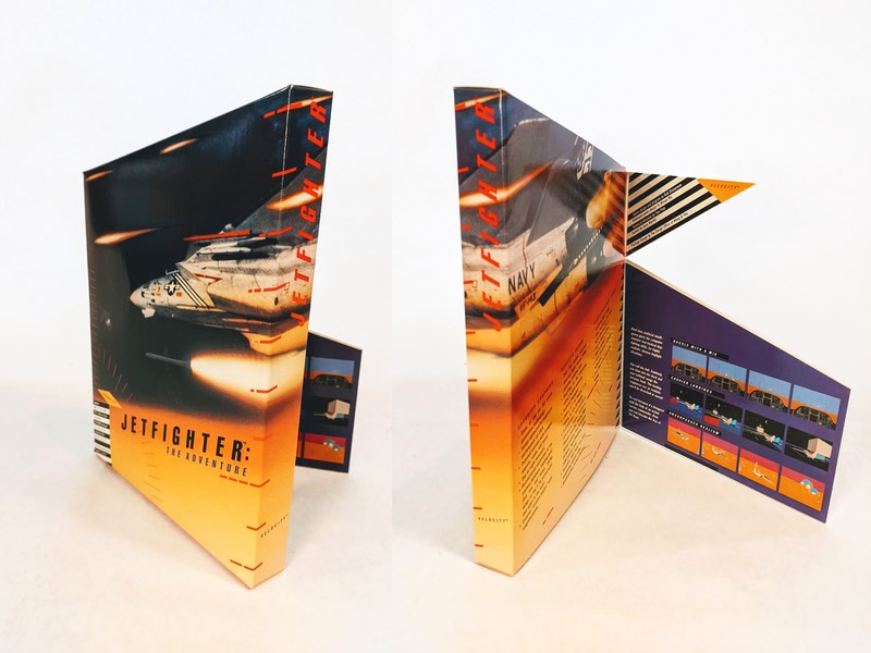
Photos courtesy of Hock Wah Yeo.
As Yeo recalls it, the software market in the late 80s and early 90s was still small enough that it was easy to get your products on store shelves, and the relatively small audience for software was eager to buy something new. “Even if you sold it in a brown bag, it would have been sold,” Yeo joked. But that was no reason to be complacent. It was an opportunity to do something new and surprising. “We knew that in time, marketing would get more difficult, that we need to have an edge. We need to create an emotional response to the product.”1 They needed to disturb the mindset, and in a software store, the way to do that was changing the shape of the box.
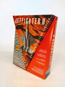
That’s what you can see above with the box for JetFighter. The top of the box is angled so that it would rise above the rest of the games on the shelf, suggesting a fighter jet lifting off at high speed. On the back of the box, two flaps fold out, loosely evoking the features on a jet’s wings. These are small changes, but significant enough that they completely alter the profile of the box. It literally stands out over the competition.
Evidently, it was a success, because Velocity brought back Yeo to make the packaging for the sequel JetFighter II. Again, he added some minor three-dimensional elements, this time with a large V-shape sticking out of the front that opened up like a lid. It’s only a small difference looking at it on a shelf, but in 1990, there was little else like this on the market.
The two JetFighter games were the first time Yeo finally got to experiment with unusual form factors, something he had always wanted to do in his design work but never had the opportunity until he fell in with the game industry. While the computer game business had existed for many years at this point, it was quickly expanding, and the lack of established norms and standards meant that developers were willing to try something totally off-the-wall to break through.8
“It was the frontier. I loved it,” Yeo told me. Compared to his old clients, he liked working with small game publishers because of their energy and their eagerness to experiment. “They were more innovative, and they were willing to look at new ideas afresh without preconceptions,” he said. “I’m so thankful that I fell into [gaming], that this allowed me to create what I created. Any other industry, it wouldn’t have allowed me that much creativity.”1 In other words, it sure was a lot more fun than designing wine labels.
Yeo’s work was starting to turn heads in the industry. Computer Reseller News, one of the early publications for computer retailers, reported in August 1991 that JetFighter and JetFighter II had “warped the notion of the traditional rectangular box […] winning itself prime floor space at several retailers.” And it wasn’t just getting attention from consumers and store-owners but from other game developers as well, who were realizing they could cut through the noise of retail spaces with distinctive packaging.8
One of those developers was Craig Fryar from Peninsula Gameworks, who was trying to figure out what to do with their new game, Spectre. It was an unconventional title — a networked multiplayer game for the Macintosh at a time when neither of those things were common — and Fryar was having difficulty finding a publisher for it. When he saw the box for JetFighter II, he knew that Velocity was the sort of publisher that would be willing to take risks. And he wanted Spectre to have a box like that too.9,10
Velocity did agree to publish the game, and once again they hired Yeo to design the packaging. This time, with some experience in odd geometries, he threw out the rectangular box and rethought the concept of game packaging from the ground up.
Spectre (Velocity, 1991)
When Yeo was making packaging for a game, the way he thought about it, he was giving the game a physical form. Software is “intangible,” he explained, and when you’re designing a box, it’s a opportunity to give the game a physical shape, to take a digital idea and turn it into a real, three-dimensional object.1
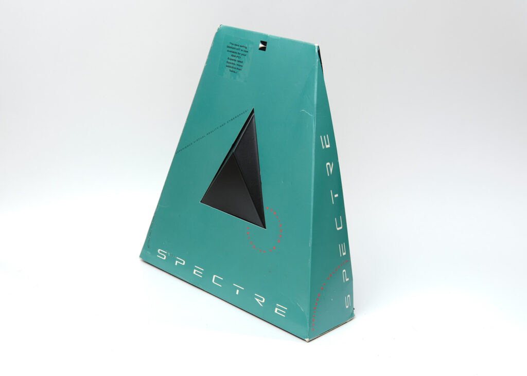
That was the idea behind the pyramid-shaped box for Spectre. The shape of the package was based on the game’s flat, low-polygonal graphics, where all the tanks are made out of single-color triangles.1 It was like the game itself was protruding into physical space, like one of the tanks had escaped into the real world, and now you could hold it.
The developers immediately supported it. “We were just knocked out,” Fryar remembered. “We were like, yep, this is gonna make history. This is gonna make waves.”10
In a store full of busy-looking packages vying for your attention, Spectre was like an object from another dimension. It was a single plain color with minimal text on the front to explain itself. It was irresistible. Thanks in large part to the packaging design, the game moved far more units than expected — upwards of half a million copies — and soon after, Fryar was fielding phone calls from other curious developers, who were thinking about ordering their own unusual boxes and wanted to learn more about the process.10
Yeo remembers he was actually contacted by someone in the book publishing industry who didn’t even play computer games but who bought Spectre, just because it was such a bizarre-looking item that he had to get it. (He wanted to commission something like that for his own company, but it never went anywhere; you can’t really make a pyramid-shaped book.)1
It was a turning point for the Design Office of Wong & Yeo. When I spoke with game developers who worked with Hock Wah Yeo, most of them said they were inspired by hire the Design Office because of the box for Spectre.11,12 Or if it wasn’t Spectre, it was the box he designed shortly after for Prince of Persia.13
Prince of Persia (Broderbund, 1992)
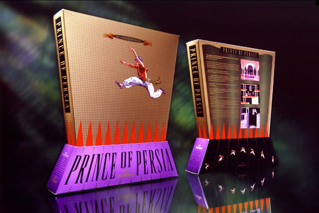
Photo courtesy of Hock Wah Yeo.
Prince of Persia had been out for three years by that point, and in preparation for a re-release and a port to the Macintosh, Broderbund decided to bring in Yeo to freshen up the packaging. They wanted something similar to what he did for the JetFighter games, something that played around with three-dimensional form. That’s when he created the famous “trapezoid” box for Prince of Persia (seen above), a two-piece design that captures the perspective and momentum of the hero leaping over a pit of spikes.
The new design outperformed their expectations: according to Yeo, when the new box was released, sales of the game tripled.1 (After the publication of this article, Prince of Persia designer Jordan Mechner confirmed the importance of the new box to the game’s success. “Prince of Persia was a flop on its first PC release in 1990; many retailers sent it straight to the bargain bins,” Mechner said. “PC sales only took off two years later when Broderbund replaced the original ‘red box’ with the big, oddly shaped one […]. Packaging matters.”)63
“From then on, all these publishers came to us and said, ‘Can you do us a Prince of Persia box?'” Yeo recalled.1
Between Spectre and Prince of Persia, Yeo’s style of unconventional box design had proven itself, and with all the business they were suddenly getting, the Design Office’s strategy of putting their name on their work had paid off. Publishers wanted to take risks, and here was a new, surprising way for their games to get attention.
But their work also exposed a rift that would vex the game industry for the next decade.
▲
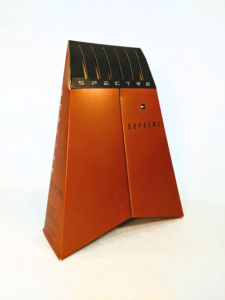
The box for Spectre was reworked in future versions based on retailer feedback, but it was still difficult to handle.10,15 (Photo courtesy of Hock Wah Yeo)
Spectre was great, but retailers hated it.
If you couldn’t tell from the picture, the box for Spectre has a black, plastic triangle sticking out of the front. According to Fryar, that triangle was a big problem for software retailers, because they would have trouble stacking the box without accidentally damaging it.10,14 It looked cool, but it took up a lot of room, and it was difficult to get on the shelves. For the follow-ups to Spectre — Spectre Supreme and Spectre VR — Yeo created a new tapered pyramid design without any elements sticking out that would be easier to handle,10 but it was still too cumbersome for some stores to deal with.
“I was at the Electronics Boutique managers’ meeting last year, and a number of them came up and told me: ‘Love your game, hate your box,'” Michael Nelson, CEO of Velocity, told Computer Retail Week in 1994. “When you get certain feedback from retailers, you have to take it to heart.”15
The lack of standardized packaging was a major source of frustration for software stores in the 1990s, and for years and years, retailers and game publishers tried to come to terms on a set of rules for what computer game boxes should look like. There were good reasons for everyone involved to reach an agreement, not only to free up precious retail shelf space and bring down manufacturing costs, but also to reduce the waste generated by continuing to make these giant, empty boxes.8,15,16,17 Despite groups like the Software Publishers Association holding roundtables with major retail chains to hash out their differences,17,18,19 there would be no consensus over the proper size of computer games for nearly a decade.20 Big stores like Kmart and Walmart threatened to go it alone and ban oversized game packaging by themselves, but they never managed to reach the critical mass necessary to force change across the entire industry.16,17,19,21
The reason everyone was reluctant to agree to any changes was that, as inconvenient as they were, big weird boxes sold well. Games like JetFighter might have been annoying to work with, but the striking packaging designs really did spark curiosity and entice sales.8,15 Dewey Thoes, the software purchaser for CompUSA, said that in the months following its release, JetFighter II — a game that’s not particularly well-known today — was one of the company’s top sellers.8
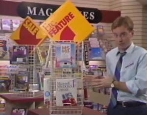
Retailers like Software Etc. placed a premium on high-quality, highly visible packaging, which would sell more units.22
“Our category is unique in that the packaging has to do all the marketing for the consumer,” said Babbage’s president Gary Kusin. If the boxes were smaller and standardized, whatever benefits that would bring the stores in terms of logistics, it would make the games seem less valuable, and that might hurt sales.21
Thus, retailers would put up with games that were shaped like, in one case, Snoopy’s doghouse from Peanuts, because they did strong numbers,15 and even if they were a hassle, no party was interested in upending their mutually beneficial arrangement. “We like what we have today,” CompUSA vice president of merchandising Ellen Miller told Computer Retail Week, “but [we’d like it] tempered.”21
Yeo was aware that the retail industry wasn’t thrilled about his packaging. But as he noted, that didn’t stop them from buying the games, and he saw no reason to make things simpler. “As long as they’re still putting out products on the shelf, we’ll continue doing it,” he said, “because my job is to get them off the shelf, into the consumer’s hands, not making it easy for the retailer.”1
Some former clients said the same thing. Edward de Jong from Magic Mouse Productions recalled that retailers didn’t have a problem as long as the software kept selling. If they couldn’t move the products, de Jong believed that was their own problem, and it was no reason to crack down on creativity. “Imagine if cosmetics had packaging rules,” de Jong said, “how boring would that be.”12
▲
The Design Office of Wong & Yeo had made a name for themselves, and now their services were in demand. “We were just overwhelmed with the amount of work that was coming in at that time,” Yeo said. Some of their clients would be as small as one person, or they could be some of the largest publishers in the industry. Whoever they were, Yeo says the process worked largely the same way.
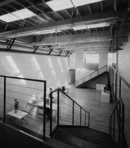
Inside the Design Office of Wong & Yeo after its makeover in 1993 (photographer Keith Collie, as seen in San Francisco: A Guide to Recent Architecture)23
When a publisher hired the Design Office to create their game box, the first thing Yeo would do is set expectations. They hired him because they wanted him to design something unique and bizarre that no one had ever seen before, and he wanted to be sure they understood what that meant. “We were upfront with all our clients that that we do is unconventional,” he explained. If they had too many restrictions or preconceived ideas about what the box should be like, he wouldn’t take the job. “If we didn’t have room to deviate,” Yeo continued, “we would say, no, this project is not right for us.”1
Then they would try out an early version of the game. It would be rude to say that the Design Office was doing quality control, but it was all about making sure that their eye-catching design work would accurately reflect the product. “We tried to tell the publishers that if you have a great product, yes, put it in a great package,” Yeo said. “But if you have an average product, don’t put it in a great package, because that’s overselling, and people will be disappointed, and they’ll return the product to the retailer. So don’t do that. The packaging is the promise of what the product has to deliver.”1 By now, the office had grown to seven or eight people and taken over an “old machine shop” in the South of Market neighborhood in San Francisco,1,23 and in the middle of their hectic schedule, they’d test out the games together, sometimes playing until four in the morning until Yeo had to chase everyone home. That was usually a good sign. “Even though it’s a beta version,” he added, “we [could] see the potential of the game.”1
The next time he met with the publisher, Yeo would bring back two box concepts. The first was the box that the publisher wanted, something in their comfort zone that matched their design specifications. It would make the client feel appreciated, because it meant the design team had listened to their input.
Then the team would bring out the second concept… which is the box they wanted. It was always something shocking and extreme, something that Yeo thought would make an even bigger impact.
To Yeo’s relief, the publishers usually went with the second idea. “I feel very grateful […] that they were able to take that leap and step away from what they preconceived it to be to what I had shown them,” Yeo said. “That’s what I liked about the people I worked with in the computer gaming world. They [were] more daring.”
“Sometimes we [did] get a little over-the-top,” he confessed, laughing. “We had no problem pulling back, because there’s always a Plan B.”1
When they did go for Plan A, the results were astounding.
Iron Helix (Drew Pictures, 1993)
CD drives used to be pretty slow. During the early years of the CD-ROM era, games tended to load slowly and move slowly, so they often focused on slow elements like exploration and puzzles. Iron Helix, the first title from game developer Drew Pictures, took those restrictions in another direction: it was a straight-up horror game.
In Iron Helix, you control a robotic probe, which has been dispatched to investigate a spaceship that’s fallen under the control of a rogue AI. While you’re gathering clues, you’re also being relentlessly stalked by a security robot that will stop at nothing to destroy you. The entire game is viewed from the small display on a worn-down computer terminal, with a warning light that periodically flashes to let you know that the security robot has found you and you need to run. Almost 30 years later, it’s still genuinely terrifying.
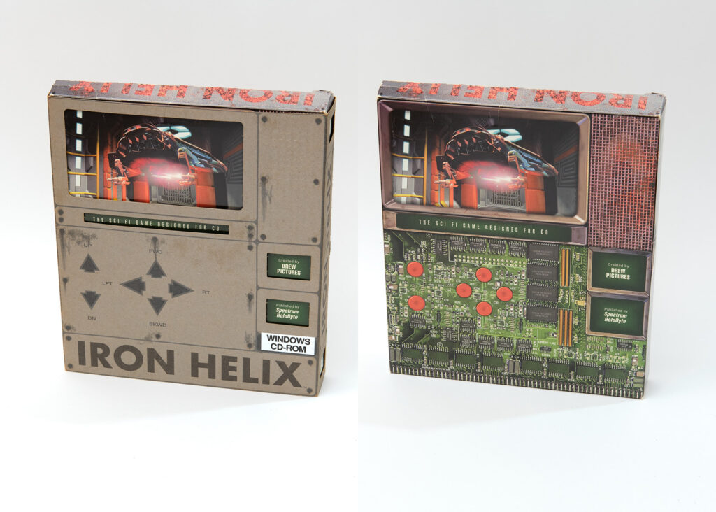
Vincent Carrella, producer for Iron Helix, described the game to me as having a “visceral quality.” It’s a tactile game, with big clicky buttons and an interface that feels like you’re watching something dangerous unfold from a mile away. When it came time to design the packaging for Iron Helix, the team wanted something that would capture that tactile, visceral feeling. They went with the Design Office because of their box for Spectre. It had a quality that was “very tangible,” Carrella said, and that was exactly what they were looking for.11
Yeo’s idea was for the box to recreate the game’s computer terminal interface, complete with the buttons standing out slightly with a relief embossing effect. Much like the package for Spectre, it takes an iconic part of the game — its very touchable interface — and manifests in the real world. The box consisted of two layers of paperboard — an outer sleeve that looked like the computer’s plastic casing, and an inner box that resembled an exposed circuit board. To open the box, you’d have to slide off the outer layer; essentially, you were opening up the computer itself. This wasn’t based on something you could do in the game, but it made the object more real, like you were having to break open the computer to get at the hardware inside.
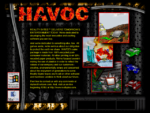
Havoc (Reality Bytes, 1995)
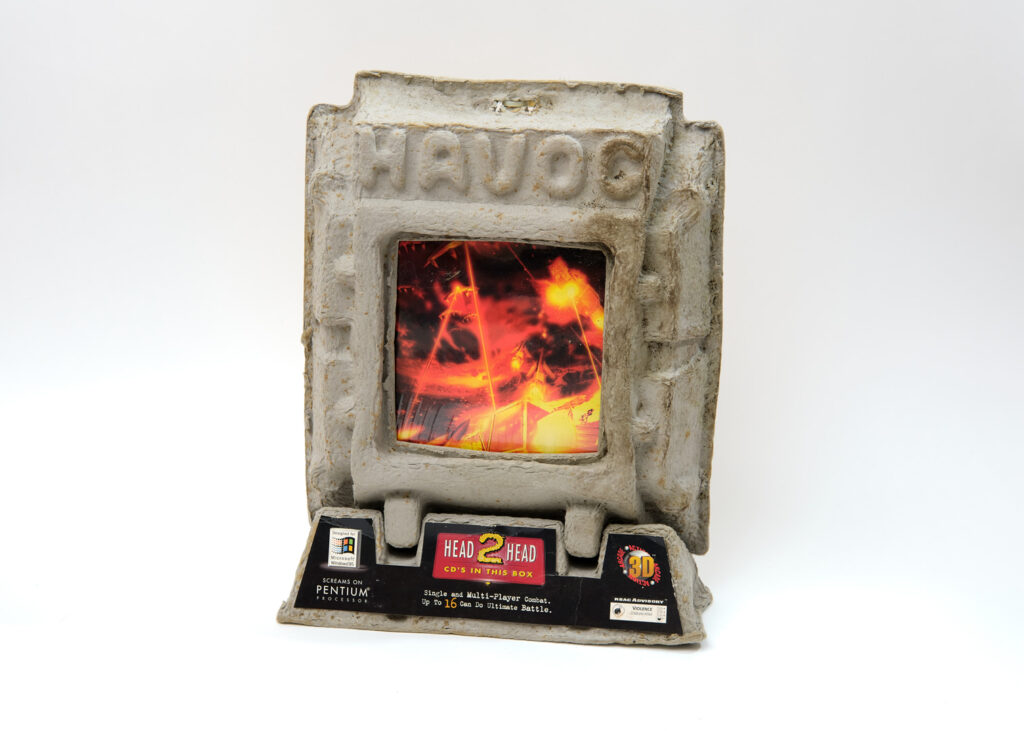
Okay, first, let’s address the obvious. Yes, this box is made out of egg carton material. The weirdest game boxes are still usually made out of paper or plastic, but this one literally looks like a piece of garbage. Maybe that’s one reason why it’s so difficult to find now, because it was just begging to be thrown away. But there’s a good reason why it looks like this!
Early in the development of the apocalyptic action game Havoc, Reality Bytes decided they wanted to do something different for packaging. Jon Chait, the co-founder of Reality Bytes, said that their original goal was to avoid using plastic jewel cases for environmental reasons, but once jewel cases were off the table, that raised “a broader question of what alternative approaches might be to traditional packaging.”13 Havoc was the first commercially released game that used the 3D graphics technology DirectX,24 and if possible, they wanted to use the packaging to draw attention to that as well.
So they wanted a three-dimensional package that looked apocalyptic while also being environmentally friendly. That’s a lot for one box to do all at once!
It was a big gamble for Reality Bytes. Chait realized they were releasing their game independently at a time when retailers were souring on first-time publishers and abnormal boxes. That’s why they turned to the Design Office of Wong & Yeo, a firm that had a track record for effective, unique, tactile 3D designs.13
This design was meant to look like a computer monitor covered in nuclear debris, and you can’t do that with conventional materials. The most appropriate, affordable thing that Yeo could think to use was the rough texture on the inside an egg carton, so he called up an egg carton manufacturer and asked them to produce it, much to their confusion.1 Reality Bytes loved that it was made out of post-consumer recycled material,13 so much that they bragged about it in the game itself.
As an added benefit, the box for Havoc came with a built-in backup plan for retailers that didn’t want to purchase a giant egg carton. That firey picture on the monitor is actually the cover of a decorative paper CD case. For European markets with tighter packaging standards (or arguably even for those stores in the United States that were rejecting oversized boxes), the CD case could be distributed by itself, without needing to produce a separate SKU.1 It’s a smart concession to retailers’ demands, though of course it was meant to be kept together as one unit.
I can’t overstate how massive and foreboding this box looks in person. Even among the unconventional boxes created by the Design Office, Havoc is remarkable. This box has clearly seen some action in the past 26 years, but it would be impossible to tell where the damage ends and the original ruined box concept begins. Any dents or discoloration have just become part of the design.
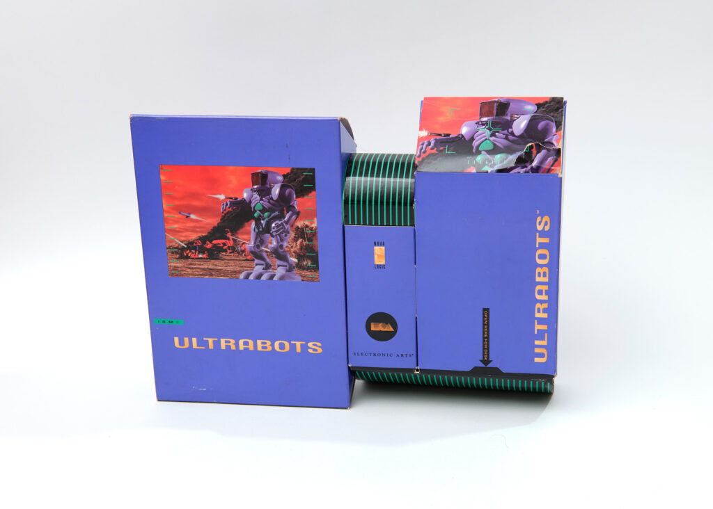
Ultrabots (Electronic Arts, 1993)
The weird boxes from the Design Office of Wong & Yeo had a lot of novelty value, but within a year of the Prince of Persia box, competitors and imitators were already hitting shelves. The game publisher Cyberdreams was releasing titles like Dark Seed that used three-dimensional relief elements on the box similar to JetFighter II,25 or something wackier like CyberRace, which has a plastic sci-fi racing vehicle leaping out of the front cover.26 The breakthrough first-person shooter Marathon by Bungie had a triangular box with inset three-dimensional features.27 Notably, the educational game company Knowledge Adventure began putting all their games in big, hexagonal packages.15 Other people were starting to play around with form, and it was losing its uniqueness.
The change didn’t happen overnight, but Yeo knew that it was quickly approaching. “We realized that, eventually, people are going to start copying our packaging, they’re gonna do these unusual forms,” he said. “So we have to take the next step.”
“We have to make something that moves.”1
That’s right, it transforms!
Ultrabots might be the furthest Yeo ever got from a traditional box. At a glance, it’s not even clear which compartment actually holds the software. Its angular style might be described today as “factory pomo,” a recently developed term for the colorful industrial aesthetic that was popular through the mid-90s. While many of those designs would imply mechanical energy through the use of gear imagery and sweeping curves, the Ultrabots box achieves it through literal movement, like the joints of one of the game’s giant purple robots sliding into place.
This was the next stage of extreme game box design, and nobody else on the market was even close. “I love that challenge,” Yeo told me, gleefully. “I love that challenge that people are gonna come after me, and I need to get a little further ahead.”1
Perhaps nobody had attempted something like this for good reason. Generally speaking, Yeo’s clients were enthusiastic about the boxes he created, but the radical design for Ultrabots received a surprisingly split reaction from Electronic Arts. “The marketing people loved it. The design production people hated it,” he said.1
Ultrabots producer Paul Grace told me that expensive product designs were not uncommon at Electronic Arts. Grace was in charge of production for the company’s military simulation games through the 80s and 90s, and he said that the need to print thick instruction manuals for those games (and large cardboard boxes to hold them) would often run up the price of production. But Ultrabots was another story. “Sales liked it, because it had shelf appeal,” he said, but given the high costs of manufacturing and assembly, there were concerns that the elaborate packaging was too much of a risk.28
Yeo was open about the fact that his boxes were often expensive. Typically, the cost of printing a rectangular computer game box was about 50 cents per unit;8 meanwhile, Yeo said that the price of his designs could go up to four dollars each.1 That’s eight times more expensive! For a $60 video game, that would be roughly 7% of the price of the item. Was it worth incurring such a large production cost to make your box stand out?
Electronic Arts took the risk, and while the box design did get people to pick it up and take a closer look, Grace said the game didn’t perform as well as they’d hoped.28 The mixed response within Electronic Arts might be a result of the company’s larger size compared to other clients, having multiple departments second-guessing decisions and managing budgets, but it also hints at some of the issues that led to these boxes falling out of style, the debate about whether the shock value at retail was worth the investment.
Flying Colors (Magic Mouse Productions, 1993)
Video courtesy of Hock Wah Yeo.
The game boxes by the Design Office of Wong & Yeo express some inner characteristic of the software. In the cases we’ve talked about so far, that tends to be an active concept you’d associate with a computer game — speed, fear, confusion, carnage. The box for Flying Colors is unique in Yeo’s portfolio, because instead of being scary, it’s beautiful.
Flying Colors was an art program developed by Edward de Jong for his company Magic Mouse Productions. It’s similar to other children’s art software that allows you to draw illustrations and decorate them with stamps, like Kid Pix, but Flying Colors is a bit more elaborate. Its big feature is “color cycling,” a technique that creates the illusion of motion by manipulating the computer’s color palette. Even on a static image, there’s a shimmering, iridescent effect, like a waterfall of color running across the page.
The box for Flying Colors builds on that cascading, multi-layered imagery. As you can see in the video above, the package consists of three rhombus-shaped boxes, connected by an axle through the center. Each box can be freely rotated, creating the appearance of a pinwheel, the purple, yellow, and teal shapes standing out against each other. It feels like the box is permanently in motion, even when it’s standing still.

An example of the shimmering “color cycling” effect in Flying Colors
As an independent software developer, de Jong had trouble getting his product off the ground. He originally developed Flying Colors under the codename Teen Pix with the goal of selling it to Broderbund as a Kid Pix followup (Teen Pix!), but Broderbund product developer Harry Wilker rejected it on the grounds that there was no market for teen software. de Jong decided to publish it independently, but few game stores were willing to carry a product from an untested independent developer; out of the national chains, only Egghead Software would agree to take it, and only after de Jong agreed to give them a wider profit margin. Despite the obstacles, he believed in the quality of his product, enough that he was willing to commission the Design Office of Wong & Yeo for a unique package.12
de Jong estimated that the entire cost of design and production was $30,000 — half for the design, half for printing and assembly. “As the only solo person who ever hired [Yeo], it was a big risk on my part,” he remembered.12 In a world where even Electronics Arts was worried about the cost of producing an elaborate box, did it make any remote sense for a one-person studio to do this?
The original run of Flying Colors — prior to being picked up educational software publisher Davidson, which re-published it in a simpler package — was very small, only 11,000 units. It didn’t even get to exhibit its full range of motion in stores, because it had to be shrink-wrapped, for good business and quality control reasons, but it was still disappointing. Evidently though, the box did its job, even in limited release: it was spotted by someone affiliated with Japanese media company Bandai, which got them to try out the software and eventually hire Magic Mouse Productions to work on licensed versions of Flying Colors for the short-lived Apple Pippin platform based on Ultraman, Dragon Ball Z, and Tamagotchi.12
de Jong called Yeo “a real perfectionist,”12 and it certainly comes through in this box, which is as much a feat of engineering as aesthetics. This version of Flying Colors is extremely difficult to find; I’m grateful to Yeo for providing this video, which shows the box in motion for the first time since its release.
▲
Yeo’s clients all used similar language to describe the appeal of unconventional packaging: it was tactile, it was physical, three-dimensional, tangible, something you’d want to touch, something more concrete that reflected how the developers thought about their own games.10,11,13 But they were also quick to remind me that the goal was always to get shoppers to pick the game up, then read what was on the back and look at the screenshots. The box draws them in, but it’s the quality of the game that would (or wouldn’t!) close the sale.10,28 This is exactly what Yeo wanted to accomplish with his designs, to shock people into grabbing the box and learning more.
This is why Yeo was so particular about finding publishers who were open to what he wanted to do. It’s one thing to hire a designer to make a standard box design, but it requires mutual trust to hand your product over to someone who wants to try something unusual and experimental with it. It’s the reason Yeo enjoyed working with some of his long-term clients, like NovaLogic, a military game developer, who he worked with repeatedly across four years on titles like Ultrabots, Armored Fist, and the Comanche helicopter flight simulator series. He knew what they wanted, and vice versa. If he and his clients shared that trust going into the design process, things went smoothly.1
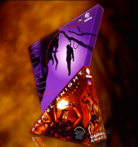
The Design Office of Wong & Yeo also created the striking box for Gabriel Knight. (Photo courtesy of Hock Wah Yeo)
Except once — with the computer game publishing giant Sierra On-Line.
The Design Office of Wong & Yeo was hired to create two boxes for Sierra. One of them was the distressingly angular, violent package for Gabriel Knight: Sins of the Fathers. John Williams, writer for Sierra’s own fan magazine InterAction,29 said it was the first time he “actually experienced fear looking at a Sierra box.”30
They had also been hired to produce a box for the Rube Goldberg-inspired puzzle game The Even More! Incredible Machine by Sierra subsidiary Dynamix, and this is where they ran into trouble. Like Ultrabots and Flying Colors, Yeo had proposed a moving box, but with even more pieces, because the box itself was supposed to be a Rube Goldberg machine! In his original design, there was a cat on the box, and when you pulled its tail, it would open a compartment with the floppy disks. It was an elaborate concept that perfectly fit with the ridiculous chain-reaction devices in The Incredible Machine series.1
However, the project soon went off the rails. During the design process, Yeo says Sierra hired a new product manager, who had previously worked in the toy industry,1 identified in InterAction as a marketer from the Nerf toy company.30 This new manager had a different direction in mind for the product that was wackier and more kid-friendly; they wanted to decorate the box with “crazy-looking graphics of people laughing [and] having fun,” as Yeo explained it, which clashed with Yeo’s design sensibilities and his emphasis on form. Even though it was a game for kids, the intended audience was kids who played science-y computer games, and he believed “they’re a little more sophisticated than that.” The Design Office disagreed with the new manager’s rigid ideas, and they backed out of the project.1
A few months later, Yeo was tipped off by a Sierra employee. The Even More! Incredible Machine had reached shelves, and the box looked suspiciously similar to Yeo’s idea!
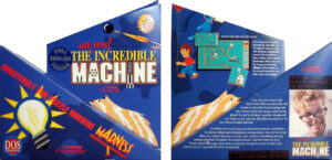
Sierra On-Line’s box for The Even More! Incredible Machine was a little too similar to Yeo’s proposal (photos courtesy of MobyGames)31
To be clear, the box that Sierra released (above) was not the same one that Yeo designed, but they had clearly used his concept for inspiration (and now with the addition of the wacky faces Yeo had rejected).1 Sierra took the credit for idea, bragging in InterAction that the packaging was dreamed up by “The Marketing People at Dynamix,” specifically giving credit to the unnamed product manager who had come over from Nerf. “What’ll they think of next?”30
The Design Office had not been paid for the original design concept. It was ironic, Yeo thought, that a company so concerned about piracy would steal somebody’s work.
Yeo was cagey about what happened next (in-between fits of laughter as he remembered the incident), but it was resolved amicably before it became a legal issue. He wrote to Sierra On-Line president Ken Williams, and within a few weeks, someone from Sierra met with him to make things right. He got compensated for his work, even if Sierra’s version did have a wacky face on the back.1
This was the exception. It’s a pretty egregious example of corporate interference. For the most part, it sounds like the Design Office of Wong & Yeo had good relationships with the developers that hired them. Yet despite their success, if you look at Yeo’s portfolio, his work with the game industry abruptly cuts off in 1995. What happened?
▲
In short, there were too many games and not enough shelf space, and retailers and publishers both had to rethink how they did business.
In the early-mid-90s, as more people purchased computers and the multimedia CD-ROM format started to catch on, the market for software rapidly expanded, and so did the amount of software you could buy. From 1993 to 1994, in the span of a single year, the number of CD-ROM software products on the market rose by nearly 50%.32 There were over now 1000 different titles available — and the average retailer couldn’t stock more than about 300 of them at a time.33 For every product they could fit on their shelves, three others didn’t make the cut.
Stores had to start making tough choices about what to buy and what not to buy.33,34 Re:Launch, a marketing strategy company that specialized in the software business, estimated in 1993 that out of the 150 new software titles being released each month, 90 percent of them were rejected by at least one retailer.35 There was just no way for them to carry everything they wanted, even at the big specialty software stores that had more room to work with.33
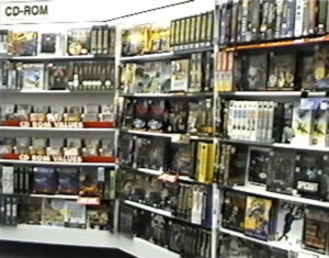
By the mid-90s, the supersaturation of the market meant that shelf space in software stores was harder to come by.36
It sounds like it should be a simple explanation: more products meant less shelf space, which meant that retailers couldn’t afford to keep stocking big oversized boxes that looked like a pyramid or a piece of nuclear debris.
But that’s not the whole story! Sure, retailers were becoming much warier about filling their stores with huge, weird boxes, which often overpromised, underdelivered, and brought in less money per square foot of shelf space,7,33,37 but high-quality packaging was still a major driver for sales.7 In fact, in the middle of this crunch for space, rather than trying to cram more games onto the shelves, Egghead Software actually removed 800 products from their stores, giving them more room to display a smaller number of products in a more attractive way. Games sold better with the boxes facing out, rather than packing them together as tightly as possible.38 So the disappearance of unconventional game boxes wasn’t just an issue of stores trying to maximize profit.
What happened was that retailers were starting to think more strategically about what titles they would order. To get the most out of their limited shelf space, they focused on stocking best-sellers and gradually culled software lines that sold slowly.33 Additionally, as more mainstream stores began carrying software, they placed more emphasis on fast turnover, trying to get popular titles on and off the shelves within months of their release to ensure that they had space to keep bringing in new inventory.39
Richard A. Bowers from CD-ROM Professional referred to this phenomenon as a “reduction cycle,”40 gradually lowering the exposure for smaller titles while making room for known sellers and established publishers.41
It’s a phenomenon that would have an enormous impact on the state of software publishing. You could design the most incredible-looking box in the world that would sell like gangbusters in stores, but that was no longer a guarantee that retailers would carry the product at a time when they were looking for safe bets and high sales.
In effect, the marketing challenge for game publishers had shifted from getting a consumer to buy your game to getting a retailer to stock your game.
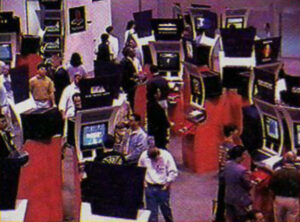
The marketing blitz of E3 coincided with the shift to the “entertainment model” of game marketing.42
Starting around 1994, the software industry transitioned to what Nina Schulyer called the “entertainment model” of marketing. If retail shelf space was harder to come by and lasted for a shorter time, the idea was to put more resources into generating hype in advance, raising awareness for the title before it was even released, the same way Hollywood studios promoted movies.43,44,45 At the same time, it was increasingly important to have a strong relationship with retailers, and new developers were finding it easier to sign with existing publishers or an “affiliate label” (like Microsoft Home or Sony Imagesoft) that had a large catalog and a recognizable brand name rather than try to negotiate with the stores by themselves.46,47,48 It’s no coincidence that right around this time also marked the beginning of Electronic Entertainment Expo (E3), a massive game industry marketing event that was originally intended as a way to advertise directly to retailers.49,50
Point-of-sale marketing with fancy packages was no longer a top priority. With fewer independent publishers, production and distribution costs rising,51 and advance marketing now critical to a game’s success, there was less compelling reason to spend $30,000 on a box that spun like a pinwheel. “All the production costs went up. Everything went up,” Yeo recalled. “So everybody pulled back.”1 Suddenly, the imaginative boxes that Yeo wanted to design were out-of-step with software publishers’ reality.
▲
Near the end of his time working with the game industry, Yeo found one more prolific client in Digital Pictures, a company that produced full-motion video games. They still wanted Yeo to design unconventional boxes, but with the retail industry moving away from unwieldy packaging, Digital Pictures also needed the boxes to conform to a traditional rectangular shape. Not ready to back down, Yeo came up with solutions that technically followed the rules while still allowing him to experiment with unusual forms.
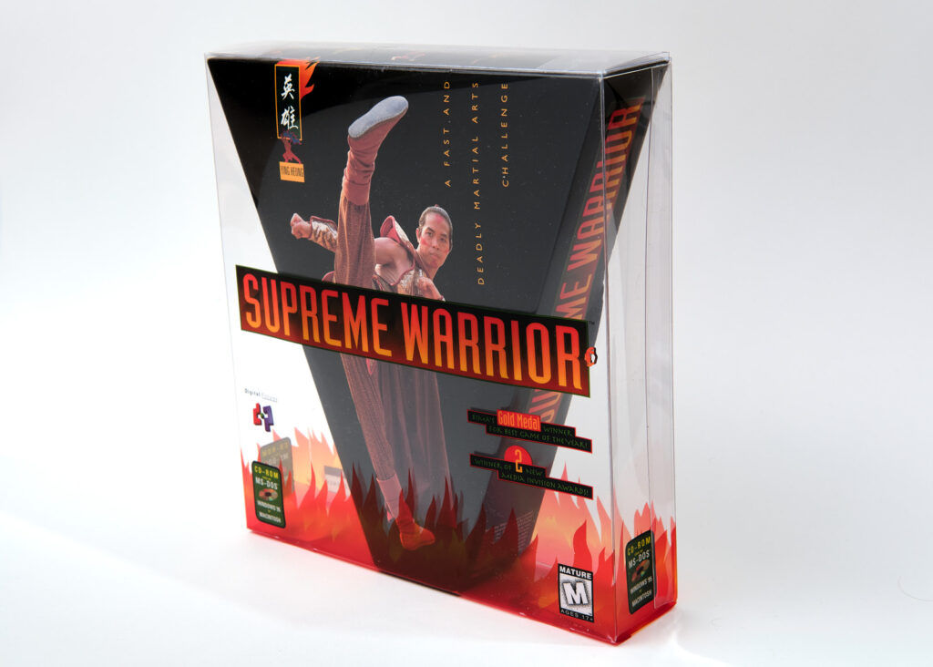
Supreme Warrior (Digital Pictures, 1995 release)
In the case of Supreme Warrior, he used transparency. As you can see, it’s a triangular box inside a clear rectangular box, so consumers would still get to see the 3D effect while stores got their normal-shaped, stackable packaging.1 Yeo would try similar ideas for semi-3D packaging with other games for Digital Pictures, like the surveillance game Double Switch, which uses a depth effect similar to Iron Helix to create the impression of looking through a keyhole. They were still rectangular boxes you could cram onto a shelf without worrying about odd shapes sticking out, but Yeo was thumbing his nose at the idea that a normal-shaped box had to be normal.
He was most excited about creating the box for Maximum Surge, which would have used multiple layers of transparent plastic to depict a spaceship flying out of a three-dimensional explosion. Unfortunately, Digital Pictures went out of business before the game was released.1
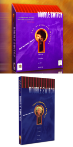
The re-release of Double Switch (bottom) tried to replicate the original design (top). Photos courtesy Yeo and Limited Run Games.53
(In an unexpected postscript to this story, one of those subtler Digital Pictures designs was actually recently re-issued. Limited Run Games, a company that produces small-batch prints of video games, would re-release Double Switch in 2019, and for the collector’s edition, they reproduced Yeo’s box design with the open keyhole as best as they could within constraints. “The packaging designs [the Design Office of Wong & Yeo] did for Digital Pictures were wild and ambitious,” Limited Run Games CEO Josh Fairhurst said, and they wanted to recreate that when they were given the chance.52 Limited Run Games typically does direct-to-consumer sales, rather than having to go through the standards of retail, and that shift towards selling consumers elaborate special editions for physical games seems to have kept a light on for unique packaging designs.)
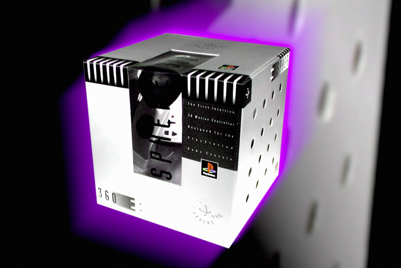
Apart from an odd job designing the box for a PlayStation controller (seen at the top of the article), that was the end of the line. It doesn’t seem like people were unsatisfied with the Design Office of Wong & Yeo, just that the industry had moved on. The retail landscape and the priorities of publishers had changed, and whatever the business or aesthetic merits of those changes, it meant that Yeo’s work had been left behind.
Heading into 1996, the demand for unusual game boxes collapsed, and the packaging design work that remained in the game industry was no longer appealing. “By then, most of the independent publishers weren’t approaching us anymore, and we had to go through the bigger companies,” Yeo said. “They were more conventional, and they were giving us projects like, ‘Well, could you create this design for this product, and here is the template for the box.'” Yeo got into design work to disturb people’s mindsets, and there was nothing disturbing to him about putting pre-designed artwork on a template. It was like going back to wine labels again. “Towards the end, it just didn’t seem interesting enough for us,” he added.1
Yeo moved on as well. He shifted his focus to web design, another emerging field with no established norms that was ripe for experimentation.1 Wong and Yeo would go their separate ways in 1996; he started his own company, Yeo Design, where he continues his design work today,4,54 but he wouldn’t get the chance to keep pushing the field of game packaging even further.
However, there were still a limited number of publishers that wanted to do something different. At the turn of the millennium, Yeo was approached for one last job with the game industry.
Sony Computer Entertainment of America wanted him to design the game cases for the PlayStation 2.
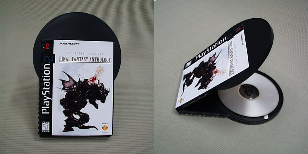
PlayStation 2 disc packaging (Sony, 2000?, unused)
In this never-before-seen prototype, Yeo was working on an idea for a unique, distinctive package for PlayStation 2 games in the United States.1 Rather than following the standard DVD case shape, the box appears to be about the size of an index card, with the space for the disc protruding out of the top, like the games were so incredible that they couldn’t be confined to their packaging. It matches with Sony’s marketing campaign and imagery for the PlayStation 2 which suggested that the new console transcended reality, best encapsulated by the fact that they produced a commercial for the PlayStation 2 directed by David Lynch.55
It’s a very rough prototype, repurposing the cover art from the PlayStation 1 game Final Fantasy Anthology with a 2 pasted on top. The choice of game leads me to believe this was produced in late 1999 or early 2000.
During production of the prototype, the higher-ups at Sony Computer Entertainment in Japan stepped in and canceled the project, preferring to use the standard DVD case design, which would have been significantly cheaper and easier to work with.1 Again, there’s understandable reasons for them abandoning this idea — I can’t imagine retailers or consumers enjoying having to deal with this design — but if Yeo’s case design had gone into production, it certainly would have made a statement. The industry as a whole, however, had gone in another direction.
▲
The final nail in the coffin for unusual packaging was hammered into place on July 20, 2000 at a conference at Walt Disney World’s towering, modernist Contemporary Resort,56 when after years of debate and non-progress, the Interactive Digital Software Association and the recently formed Interactive Entertainment Merchants Association57 finally agreed to a joint proposal to standardize the size of computer game boxes.20,58 There’s a number of ways to read it — a win for collective action by the retail market;20 an attempt to prove the game industry’s ability to self-regulate in the wake of their scapegoating for the Columbine massacre;57,58 or perhaps just a realization that with three new game consoles hitting the market that used standard DVD case-style packaging, it was simply time to face the music.20 It would still take a while to implement,59 but undoubtedly, that panel at 10am in the Happiest Place on Earth marked the end of the “big box” era of computer games.55
“This new format has very few downsides,” hailed IEMA president Hal Halpin in a press release. “It’s more environmentally friendly; it’s cheaper to manufacture and ship; it makes for enhanced merchandising at the store level, and it’s identifiable.”20 It was also, for better or worse, kinda boring.
Looking back 25 years later, I think it’s easy to lament the loss of creative box designs, especially when they’re still so exciting to look at. A box is a box, but a box shaped like a pyramid forces us to totally reconsider what a box could be. I started researching the Design Office of Wong & Yeo after obtaining a copy of Ultrabots in fall 2020, because it was so physically irresistible and cumbersome that it’s difficult to believe there was ever a time when it was acceptable, or if there was, it must have been a wilder and more daring time than today.
In truth, there’s the impression that even in the early 90s, boxes like this were divisive, and the industry was searching for some kind of restraint. Even on the consumer side, there was opposition; the short-lived fan magazine CyberSurfer once ran an editorial asking game publishers to stop making huge, wasteful packaging that only served marketing purposes.60 It’s telling that several developers who were self-declared fans of this type of packaging viewed it as both an advantage and a hindrance.13,15,28
That’s what I find so interesting about these boxes, that they had to exist within the dueling pressures of what stores were willing to accept and how far game publishers were willing to push them. Looking at Hock Wah Yeo’s designs, you can see the boundaries of the software industry stretching out — and the practical constraints of business come crashing back.
▲
Special thanks
This article would not have been possible without a bunch of people’s help!
- Dennis Pitman, for photographing my copies of the games featured in this article!
- Amanda Steadman, for helping me safely deliver the games to Dennis in the middle of a pandemic.
- Carly Kocurek, for inspiring me to think about the politics of shelves.
- Simon Carless, for encouraging me to write about this topic.
- Richard Moss and Keith Kaisershot, for tracking down pictures and examples of other game packaging mentioned in the article.
- AnnK, for sharing the article from CyberSurfer.
- Jesse Kumin, photographer for the stylized product photos provided by Hock Wah Yeo.61
- The folks from the Consumer Aesthetics Research Institute, for helping me wrap my head around the aesthetics of this era and how to approach consumer-facing design.
Appendix
For the sake of completion, I wanted to include a list of every game and software product that Yeo (and the Design Office of Wong & Yeo) worked on. There may be others that the Design Office was not credited for; I’ll keep this list updated if other examples are identified!
- Deadly Towers (Broderbund, 1987, NES)
- Lode Runner (Broderbund, 1987, NES)
- Spelunker (Broderbund,1987, NES)
- Raid on Bungeling Bay (Broderbund, 1987, NES)
- The Guardian Legend (Broderbund, 1988, NES)
- JetFighter: The Adventure (Velocity, 1988, DOS)
- The Battle of Olympus (Broderbund, 1989, NES)
- Legacy of the Wizard (Broderbund, 1989, NES)
- Ys: The Vanished Omens (Nihon Falcom, 1989, DOS)
- Curse of Babylon (Xtalsoft, 1990)
- Dusty Diamond All-Star Softball (Broderbund, 1990, NES)
- JetFighter II: Advanced Tactical Fighter (Velocity, 1990)
- Spectre (Velocity, 1991)
- Comanche: Maximum Overkill (NovaLogic, 1992)
- Prince of Persia (Broderbund, 1992 release)
- JetFighter II: Operation Lightning Storm (Velocity, 1992)
- Comanche: Maximum Overkill — Mission Disk 1 (NovaLogic, 1993)
- Flying Colors (Magic Mouse Productions, 1993)
- Gabriel Knight: Sins of the Fathers (Sierra On-Line, 1993)
- Iron Helix (Drew Pictures, 1993)
- Prince of Persia 2: The Shadow & The Flame (Broderbund, 1993)
- Spectre Supreme (Velocity, 1993)
- Spectre VR (Velocity, 1993)
- Ultrabots (Electronic Arts, 1993)
- Wolf Pack (NovaLogic, 1993 release)
- Armored Fist (NovaLogic, 1994)
- Comanche CD (NovaLogic, 1994)
- Corpse Killer (Digital Pictures, 1994)
- Kids on Site (Digital Pictures, 1994)
- Supreme Warrior (Digital Pictures, 1994)
- Comanche 2 (NovaLogic, 1995)
- Double Switch (Digital Pictures, 1995)
- Havoc (Reality Bytes, 1995)
- Quarterback Attack (Digital Pictures, 1995)
- Slam City with Scottie Pippen (Digital Pictures, 1995)
- Werewolf vs. Comanche (NovaLogic, 1995, unconfirmed)
- Maximum Surge (Digital Pictures, 1996, unreleased)
- Sphere 360 PlayStation controller [SLUH-00028] (Asciiware, est. 1997)62
- PlayStation 2 disc packaging (Sony Computer Entertainment of America, 2000, unused)
References
1. Yeo, Hock Wah. (2021, February 16). Zoom interview.
2. Kohler, Chris. (2013, March 8). Back Lord British’s Kickstarter, Get This $5,000 Game. Wired. Retrieved from https://www.wired.com/2013/03/akalabeth/
3. City and County of San Francisco, Mayor’s Office of Community Development. (1993) Grantee Performance Report, Community Development Block Grant Program. Retrieved from https://archive.org/details/granteeperforma1993sanf_0/
4. Yeo Design. (n.d.) Yeo Design, Graphic & Product Design Firm. https://yeodesign.com/
5. The Strong National Museum of Play. (n.d.). Computer software: Commodore 64 Thinking Cap: The Outline Professor. Google Arts & Culture. https://artsandculture.google.com/culturalinstitute/beta/asset/computer-software-commodore-64-thinking-cap-the-outline-professor/XQFg__TsloUp5A
6. Schuyler, Nina. (1995). The Business of Multimedia. Allworth Press, pp. 42-43. Retrieved from https://archive.org/details/businessofmultim00schu/
7. Richard, Kathleen. (1994, January 17). Packages under scrutiny — Retailers’ wish lists come true as vendors overhaul software boxes. Computer Retail Week, 455, p. 77. Retrieved from Factiva.
8. Clancy, Heather. (1991, August 19). Smaller developers focus on packaging. Computer Reseller News, 17, p. 70. Retrieved from Factiva.
9. Moss, Richard. (2018). The Secret History of Mac Gaming. Unbound, pp. 151-153.
10. Fryar, Craig. (2021, February 23). Phone interview.
11. Carrella, Vincent. (2021, February 17). Phone interview.
12. de Jong, Edward. (2021, February 12–13). Email correspondence.
13. Chait, Jon. (2021, February 11). Email correspondence.
14. Moss, p. 158.
15. Wald, Michael. (1994, May 23). Retailers Look Closely At Package Design Before Placement — Odd boxes may get turned away. Computer Retail Week, 463, p. 70. Retrieved from Factiva.
16. Karvetski, Kerstin. (1994, May 23). Continuing debate over packaging may get costly — Frustration Sets In For Vendors As Retailers Differ On Requirements. Computer Retail Week, 463, p. 69. Retrieved from Factiva.
17. Mitchell, Gabrielle. (1994, May 23). CD-ROM design is free-for-all — Handleman Speaks Of Banishment Unless Vendors Meet Its Standard. Computer Retail Week, 463, p. 70. Retrieved from Factiva.
18. Mitchell, Gabrielle. (1993, March 22). Packaging Problems Persist — Standards elude CD-ROM boxes. Computer Retail Week, 338, p. 1. Retrieved from Factiva.
19. Mitchell, Gabrielle. (1993, October 18). Packaging push gains support. Computer Retail Week, 350, p. 9. Retrieved from Factiva.
20. Video & Computer Game Retailers Call for Standardization in Game Packaging. (2000, June 26). PR Newswire. Retrieved from Factiva.
21. Mitchell, Gabrielle. (1994, December 19). Still no agreement concerning packaging standards. Computer Retail Week, 484, p. 42. Retrieved from Factiva.
22. Screencapture from: Software Etc. (ca. 1991). 1001 Retailing Nights [Video]. YouTube. Retrieved from https://www.youtube.com/watch?v=CsG47Jbf6CM
23. Lloyd, Peter. (1997). San Francisco: A Guide to Recent Architecture. Ellipsis London Limited, pp. 66-67. Retrieved from https://archive.org/details/sanfranciscoguid0000lloy/
24. Reality Bytes. (1995, October 30). Reality Bytes, Inc. Begins Shipping Havoc — The First Ever Game to Ship with Windows® 95 Native DirectX™ Performance [Press release]. Retrieved from https://www.mobygames.com/game/havoc/adblurbs
25. LGR. (2015, April 20). LGR – Unusually Shaped PC Game Boxes [Video]. YouTube. https://www.youtube.com/watch?v=fi64HL4sY24
26. CyberRace (1993) DOS box cover art. (2001, August 25). MobyGames. https://www.mobygames.com/game/dos/cyberrace/cover-art/gameCoverId,8525/
27. Kaisershot, Keith. (2021, February 18). Twitter direct message.
28. Grace, Paul. (2021, February 19). Email correspondence.
29. Williams, John. (n.d.) John Williams. Sierra Gamers. https://www.sierragamers.com/john-williams/
30. Johnie Magpie. (1993, Winter). Rumor Mill. InterAction Magazine, 6(3), p. 65.
31. The Even More! Incredible Machine (1993) box cover art. (2010, June 9). MobyGames. https://www.mobygames.com/game/even-more-incredible-machine/cover-art
32. Richards, Kathleen. (1994, December 19). CD-ROM momentum impacts floppy sales. Computer Retail Week, 484, p. 2. Retrieved from Factiva.
33. Bowers, Richard A. (1994, November/December). Distributing The Wealth: Sliding CD-ROM Into The Consumer Channel. CD-ROM Professional, 7(6), pp. 17-20. Retrieved from https://archive.org/details/sim_eventdv_november-december-1994_7_6/
34. Schuyler, pp. 45-46.
35. Karvetski, Kerstin. (1993, November 1). Gaining distribution challenges vendors — Nearly 90% of Products are Turned Down. Computer Retail Week, 351, p. 82. Retrieved from Factiva.
36. Screencapture from: Martin, Cyrus. (2019, December 21). Walden Software and Babbages 1997 Video Game Store B-Roll Footage [Video]. YouTube. https://www.youtube.com/watch?v=L12MT_UsQeA
37. Gussin, Lawrence. (1996, November). The Consumer Title Publishing Business. CD-ROM Professional, 9(11), p. 44. Retrieved from https://archive.org/details/sim_eventdv_1996-11_9_11
38. Bowers, p. 28.
39. Gussin, p. 52.
40. Bowers, p. 20.
41. Bowers, pp. 18-26.
42. Photo from: E3 Coverage. (1995, July). GameFan, 3(7), p. 40. Retrieved from https://retrocdn.net/File:GameFan_US_0307.pdf
43. Schuyler, p. 7.
44. Schuyler, pp. 16-19.
45. Gussin, pp. 52-54.
46. Allread, Jessee J. (1996, June). Representation Makes Reputations: Publishers, Reps, and Retail. CD-ROM Professional, 9(11), pp. 110-111. Retrieved from https://archive.org/details/sim_eventdv_1996-11_9_11
47. Bowers, pp. 22-30.
48. Schuyler, p. 19.
49. Atlanta Chosen as Site for New Trade Show. (1994, March). GamePro, 56, p. 186. https://archive.org/details/GamePro_Issue_056_March_1994/
50. Campbell, Colin. (2019, June 7). The story of the first E3. Polygon. https://www.polygon.com/features/2019/6/7/18653968/e3-history-1995-sega-saturn-nintendo-64-playstation-launch
51. Gussin, pp. 56-57.
52. Fairhurst, Josh. (2021, February 16). Email correspondence.
53. Switch Limited Run #41: Double Switch Classic Edition. (2019). Limited Run Games. https://limitedrungames.com/products/switch-limited-run-41-double-switch-classic-edition
54. Wong & The Design Office. (n.d.) About. https://www.wongdesign.com/about-.html
55. Dom, Pieter. (2014, May 5). The Making Of David Lynch’s PlayStation Commercial: The Third Place. Welcome to Twin Peaks. https://welcometotwinpeaks.com/lynch/david-lynch-playstation-commercial-making-of/
56. Interactive Entertainment Merchants Association. (2000). Conference Agenda. The IEMA Executive Summit June 27-30 2001. https://web.archive.org/web/20000818033907/http:/www.executivesummit.com/pages/conference.asp
57. Interactive Entertainment Merchants Association. (2001). About the IEMA. https://web.archive.org/web/20010406112244/http://www.theiema.com/about.html
58. Traiman, Steve. (2000, August 12). Video Gamers Debate Packaging, Ratings. Billboard, p. 54-55. https://archive.org/details/bub_gb_fBAEAAAAMBAJ/
59. Courter, Heather. (2000, July 20). News From the IEMA: July 2000, Executive Summit [Press release]. Interactive Entertainment Merchants Association. https://web.archive.org/web/20010409082620/http://www.theiema.com/news/72000.html
60. Editors of The CyberSurfer Magazine. (1995, July). Open Letter to the CD-ROM Industry. CyberSurfer, 2, p. 3. https://archive.org/details/CyberSurfer02Jul1995/
61. Yeo Design. (n.d.) Yeo Design, Packaging Design. https://www.yeodesign.com/packaging-design
62. Having a Ball?: Spacetec, ASCII Set to Unleash New 3-D Control for PlayStation. (1996, October). Electronic Gaming Monthly, 87, p. 28.
63. Mechner, Jordan. (2021, March 3). Prince of Persia was a flop on its first PC release in 1990; many retailers sent it straight to the [Tweet]. https://twitter.com/jmechner/status/1367003123361984515
64. Wong, Valerie. (2021, March 18). Email correspondence.

Fantastic, fantastic article! I started reading it, and I went “If the box for Spectre isn’t in here, then I don’t understand anything.” I remember gaping at it on the shelf of my local Babbage’s. And I had completely forgotten about that UltraBots box, but seeing it again brought me back.
I get why the industry moved away from allowing this sort of aesthetic, but here is my sad face for them doing so: 🙁
This is utterly brilliant reporting. Thanks so much for all the hard work.
I couldn’t help but notice that X-CAR is not part of the list, but sure seems like it should be. Was that one of their designs?
Thank you!
I came across XCar too, but as far as I can tell, it wasn’t from the Design Office of Wong & Yeo. There’s a couple of late-wave odd boxes (mostly by Eidos like Tomb Raider, Thief, and Final Fantasy VII) that seemed to take inspiration from their work, but Yeo was largely out of the game packaging business by 1996. There could be credits listed in the manual that say who the designer was, but I wasn’t able to find a copy online.
Brilliant article! I have an irrational nostalgia for the 90’s that just won’t go away, and this points up one of the reasons why. Developers were creating new genres, imaginations were running wild with possibilities, and that experimentation extended all the way to box design. What an exciting time! I’m so glad I was alive to experience things like this. Things were not quite so jaded back then.
Awesome article ! The packaging is a pretty interesting side of gaming marketing. I especially love the look of old Accolade game boxes made by the design company Galarneau & Sinn.
I listed some old articles about documentation and packaging in magazines, with several mentions in Computer Gaming World, that could complete your analysis :
https://www.abandonware-france.org/bibliotheque/magazines/recherche/?motscle=%23packaging
Also, do you know if they made the weird box of Sid & Al’s Incredible Toons ? It was released around the same time than Gabriel Knight.
Excellent article! I worked with Yeo while I was art and design director at Digital Pictures, early to mid-90s. Yeo’s designs were and still are ahead of their time. Though there were many challenges to overcome, regarding production and technique, Yeo was the most innovative and unique packaging designer I ever worked with. His work deserves a place in the Game Packaging Design Hall of Fame and/or Game Museum, if there is such a thing. -Lode
I loved this article. A peek back to a time when the industry was trying anything to grab people’s attention. It makes a lot of sense too how in 94 they started focusing more on hype and anticipation rather than the packaging itself (and here we are today). Great work 😀
Hey I just saw an archival photo with one of these boxes visible! There’s a profile on Jane Jensen at Vice that went up a few days ago, and a little past midway through is an (undated) photo of her from her EA days, and right on the shelf behind her is the “distressingly angular” one, left of skull:
https://www.vice.com/en/article/epdjxk/gabriel-knight-creator-jane-jensens-successful-second-act-erotic-novelist
I wouldn’t have noticed it really, but from just reading this a few weeks ago, I was like, “Oh that’s gotta be a Hock Wah Yeo box!”
Hock Wah Yeo, as a student at California College of Arts and Crafts in Oakland, CA, often gleefully told me as he burned the late nite oil in our apartment working on a project “I am a genius! Come see!” Indeed ! He was and continues to be a gleeful genius as illustrated in your wonderful article. Thank you for reminding me of gleeful genius!