Two odd Monopoly games in context 
With so many new options for social board games in the past decade, a consensus seems to have emerged: Monopoly sucks.
Yet despite its reputation as a monotonous game that ruins friendships and parties, Monopoly has endured. It survives because, thanks to aggressive licensing and marketing by Parker Brothers and Hasbro, it can become whatever it wants. It can be rethemed to any hit movie or basically any topic. It can adapt itself into a card game, a TV show, or a fast food promotion. Monopoly has learned how to be everywhere.
Monopoly is a shape-shifter, and it takes on the form of whatever it changes into to stay alive. That’s true of the video game adaptations too. Nearly every North American game system since the 80s has had a version of Monopoly, each one a little different to fit the expectations of the platform and the era.
I want to focus on two older, weirder video game editions – a Macintosh version and a PlayStation version – and what they can tell us. Although these two don’t substantially alter the rules or the game itself, the unique ways they present the same board game, six years apart, can explain the changing contexts they were released in.
Macintosh
Human Wave Technology’s 1991 version of Monopoly is a bit silly because the Macintosh was a bit silly. The early games and software for the Macintosh were small, self-consciously quirky titles by independent developers. You can see those influences in the approach of this Monopoly, which, despite being a licensed game, seems right at home with the Mac’s library of shareware oddities.
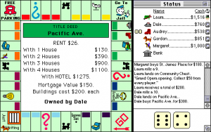
The defining trait of this Monopoly – and other early Mac games – is its self-awareness about being on a computer with a mouse and windows rather than a game console. The game liberally uses elements of computer interfaces. Players’ assets are arranged in pop-up windows, and to propose a trade, you drag property between the windows like they’re files on a computer. When the game ends, the results screen shows a graph of every player’s assets over the course of the game, like an Excel chart.
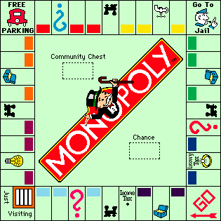
The game has a flat art style with simple colors, which gives it a cartoonier look than the actual board game. (The dog token, usually a silver-painted terrier, looks like a brown weiner dog in this one.) Part of this might be that the graphics had to translate easily to the black-and-white version of the game. Many Macintosh computers didn’t have color monitors yet at that time, and the game accommodated the limitations of its platform.
Although this is a fairly straightforward adaptation of Monopoly, it finds opportunities to be goofy about it. It opens up with Rich Uncle Pennybags, the Monopoly mascot, juggling the player tokens, screwing up, dropping them, and crying. Uncle Pennybags just can’t catch a break. It’s an endearingly pointless gag. And because the Macintosh had strong audio support, like other Mac software, the game uses wacky sound effects for certain events, like a drain flushing when you land on the Water Works space. If a player goes bankrupt, a baseball umpire shouts “Yer ouuut!”
The game shows its particular sense of humor best when you turn on Set Up Mode, which lets you cheat and rearrange the game. Usually, trying to take money out of the bank’s inventory triggers an alarm sound and warns you that “Bank robbery is against the law!” With Set Up Mode on, when you rob from the bank, your cursor turns into a gun! And it still cautions that if you try to steal more than $10,000, you have to report it to the IRS. (I’d imagine that most players probably wouldn’t even turn on Set Up Mode and mess with this!)
Human Wave’s Monopoly is lightly funny and self-aware, and it maps the features of the board game to the features of a desktop computer. That matches the Macintosh’s style at the time. There was still novelty to a computer interface in 1991, and revisiting this Monopoly almost three decades later, it feels clever all over again. Being silly, though, is timeless.
PlayStation
If the Macintosh Monopoly is quiet and sly, the PlayStation version is screaming and grabbing you by the throat. The PlayStation and the CD-ROM format helped usher in a wave of flashy multimedia in games – not just video cutscenes everywhere and CD-quality audio but the intensity of them! Not even Monopoly could ignore it, and so we ended up with Gremlin Interactive’s 1997 Monopoly, a truly incredibly over-the-top experience.
The throat-grabbing begins almost immediately with the opening cutscenes. The Gremlin Interactive logo is depicted like a rockstar, emerging out of a lake on a stage covered in scaffolding and spotlights, surrounded by fireworks.

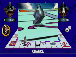
Big ol’ shoe, walkin’ about town (I wanted to come up with a better caption, but this got stuck in my head, sorry)
This version of Monopoly is based partially on another computer version from 1995 by Westwood Studios. Specifically, it borrows that game’s pre-rendered cutscenes, which are a feast of comically overproduced 3D animation. The game uses for them for everything.
The videos show the player tokens going around the board, but they don’t just move around. They have character. The laundry iron piece flops and leaps across the board like a salmon migrating upstream, and when it gets near the jail space, it avoids it by flipping into the wind like a piece of paper. The tokens are basically rubber. Other Monopoly adaptations have given the player pieces animations so they can hop or walk, but this is ridiculous, and I wouldn’t want it any other way. After seeing the thimble piece flipping end-over-end across the board, could you imagine it moving like an actual Monopoly token? Nonsense.
The properties on the board also have their own cutscenes, and they’re absurd and full of personality too. Mediterranean and Baltic Avenue, the two lowest-value spaces on the board, look like a post-apocalyptic wasteland. As the properties increase in value, they get visibly nicer, and sometimes they have little vignettes; there’s a cat at Indiana Avenue who loses a fight against a sunflower.
The game seems to realize how overdone this is. When you land on a railroad property, the video shows a realistic-looking train station… with a flat, solid black Monopoly train, just like the drawing on the board, wildly out of place. Hell yeah this is way too much for a Monopoly game!
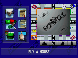
There’s much less focus on actually being a good version of Monopoly. The menus for trading property or buying houses are a mishmash of animated buttons, flashing game board icons, and a cursor controlled with the directional pad, trying to act a mouse pointer. This is far from an ideal way to play Monopoly, and you can tell it mattered more that the mortgage button had a 3D piece of paper on it. Or that you can select from four background music tracks – mostly 1930s-sounding lounge music but also one new age piece that, much like the train station cutscene, is barely appropriate.
The extreme animations and music make a huge difference. Despite the bad interface, the PlayStation Monopoly is eye-popping and captivating in a way that other Monopoly games aren’t. Later console adaptations of Monopoly, like the edition on the Nintendo Switch, have a visually intense city as well, but it’s part of a consistent aesthetic of grandeur and opulence and not as shocking as the PlayStation version’s full-throated approach.
When every other game on the console was like this, Monopoly had to be as well. But because it pulls out all these effects for Monopoly, of all things, it stands out rather than blends in.
Takeaways
Between these two interpretations of the same game, we can tell what characteristics of each platform – and each moment in time – the developers drew on. There’s a clear contrast between the simpler, joke-y resourcefulness of the Mac adaptation and the bombastic PlayStation version. That’s the difference between a game discovering what it can do in a developing digital format and a game, having learned that, seeing how much it can do all at once.
These aren’t the only qualities of the Macintosh or PlayStation, of course, but they’re what the developers honed in on to make their versions distinct. Monopoly isn’t supposed to stick out; it’s meant be ambient, to fold into the trends happening around it. When you see a misguided adaptation like Monopoly for Millennials, it’s attempting the same thing – imitating trends. And for the video games, during the transitional era where games were reconsidering what they wanted to be using 3D graphics and new multimedia technology, Monopoly would mimic that uncertain transition too.


Amusingly, the PC version of Westwood Monopoly was one of the earliest games I played multiplayer over the Internet, supporting TCP/IP play!
I remember the C64 version I owned.
https://www.youtube.com/watch?v=J9SpfUB8dk0